


HTML RWD DESIGN TECHNIQUE
For Webpage Layouts
I have had so many requests for more information on how to layout a page so that content can be added in many different areas... So here's the way... using the RWD Layout Design Technique...
NOTE: For beginners I recommend RWD (Responsive Web Design) for layout techniques...INFO HERE
Remember...you will be making your WHOLE PAGE into a big Row and Column Format using HTML Divisions (<div>)and CSS Classes (class="name")... this will create a sort-of "page format" to locate elements and content on your web page... READ W3Schools GRID VIEW ...
Also I will include using another RWD Layout method which employs GRID MODULES... Remember...you will be making your WHOLE PAGE into a big Row and Column GRID using CSS Coding ... this will create a sort-of "page grid" to locate elements and content on your web page... READ W3Schools GRID MODULES ...
And...you can fill each area with Text, Images, Links, Tables OR leave it BLANK (put in ) to create a "space" area...
You can use background colors ( style="background-color:#??????;" ) to create even more effects...
Below are several page layout examples using a RWD Format with the source code below each...for you to study or copy for your own page source code!
You can make other Layout Formats to suit your choice!
For lessons on RWD go to W3Schools
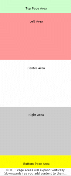
EXAMPLE #1
| Top Page Area |
| Left Area | Center Area | Right Area |
| Bottom Page Area |
TO ILLUSTRATE RESPONSIVE DESIGN (RWD) I will present the Above Page Layout Code (for EXAMPLE 1) ...Here Below Using RWD Coding:
NOTE... HOWEVER... THAT FOR THE ABOVE RWD CODE, THE FOLLOWING CSS CODE WAS USED (placed in the head section or on a separate style sheet):
IN ADDITION THE FOLLOWING VIEWPORT CODE WAS PLACED INTO THE HEAD SECTION OF THE PAGE:
 Full Page VIEW (From an IPhone 6+)
You can see how the divisions "line-up" vertically for the smaller screen size!
TO ILLUSTRATE THE GRID Module METHOD ... HERE IS THE SAME EXAMPLE, USING THE RWD GRID Module METHOD:
AND AGAIN BESIDES PLACING THE Viewport Code INTO THE HEAD SECTION ... THIS STYLING CSS CODE WAS PLACED THERE:
EXAMPLE #2
| Top Page Area | |
| Left Area | Main Area |
| Bottom Area |
TO ILLUSTRATE RESPONSIVE DESIGN (RWD) I will present the Above Page Layout Code (for EXAMPLE 2) ...Here Below Using RWD Coding and like all the RWD Code, you need to place the appropriate STYLE and VIEWPORT Codes into the page's HEAD Section... as referenced above:
EXAMPLE #3
| Left Side Area |
Top Page Area |
| Next Area | |
| Next Area | |
| Next Area | |
| Bottom Page Area |
TO ILLUSTRATE RESPONSIVE DESIGN (RWD) I will present the Above Page Layout Code (for EXAMPLE 3) ...Here Below Using RWD Coding and like all the RWD Code, you need to place the appropriate STYLE and VIEWPORT Codes into the page's HEAD Section... as referenced above:
EXAMPLE #4
Your
Top Main Area
|
Right Side Bar |
| Lower Text Area |
TO ILLUSTRATE THE GRID Module METHOD AGAIN ... HERE IS EXAMPLE 4, USING THE RWD GRID Module METHOD (The Complete Page Code):
For lessons on RWD go to W3Schools